E-commerce UX: essential design principles
The growth in popularity of e-commerce in recent years has raised users’ expectations about the online shopping experience, which must be as smooth and seamless as possible to avoid losing their trust.
When designing an e-commerce site, it is therefore necessary to keep two goals in mind: minimize the friction the user encounters during purchase and make the most of every opportunity to meet the user’s needs, thus fostering the development of a relationship that lasts.
But what are the essential design principles and strategies for designing a memorable shopping experience? In this article we recount what we have learned in our experience at Moze, taking as examples some of the e-commerce sites we have built and following the key steps in the buying process:
- Homepage
- Product search
- Product page
- Checkout
- Satisfaction
Homepage
Get your brand noticed
The first moments when users visit an e-commerce homepage or landing page are critical to capture attention, make clear what products are for sale, and how the brand is positioned in the marketplace.
The e-commerce of a high-fashion company will look very different from that of a low-cost technology marketplace. For example, the shoe brand Volta communicates the quality of its products through the creative look of its photographs and minimalist design to target trend-conscious people.
Clearly communicating one’s brand through the design of the site helps users instinctively know if they are in the right place and eventually continue confidently to explore the catalog.
Clearly communicate the value of products
The homepage can be leveraged to make it immediately obvious how your products can solve potential buyers’ problems, enhancing their experience.
Using short, direct text and images that emphasize product benefits is important to invite users to learn more about the offer.
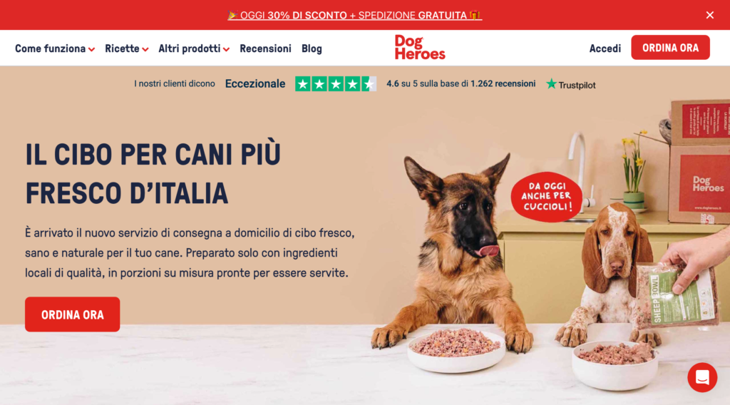
By using these tricks, Dog Heroes makes its brand value proposition immediately clear, which is to improve pet nutrition with fresh, quality food.
“The best way to choose copy for every single page of the site, ads or any other content is definitely to think with two heads, the first one being that of the target audience and the second one being that of the brand. Users’ attention span is limited and saying the right thing at the right time is crucial; that’s why we need to focus on what makes us unique.
Why talk about how bad nutrition is harmful when you can highlight the benefits of a quality product?
This way you can help the user focus on the importance of the food they choose for their dog and the positive potential of their owner’s choice.
Mission accomplished!”
Marco Lagana
Founder, Dog Heroes
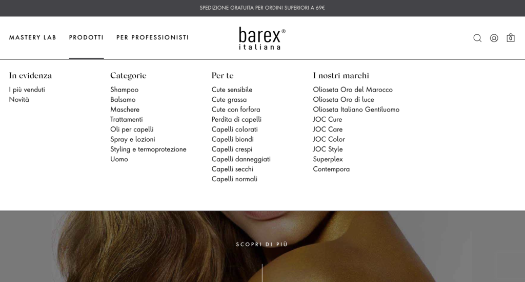
Product search
Make products searchable
Allowing product search within the site helps users who already have a defined idea of what they are looking for, especially when the catalog is very large and navigating between pages would be very inconvenient.
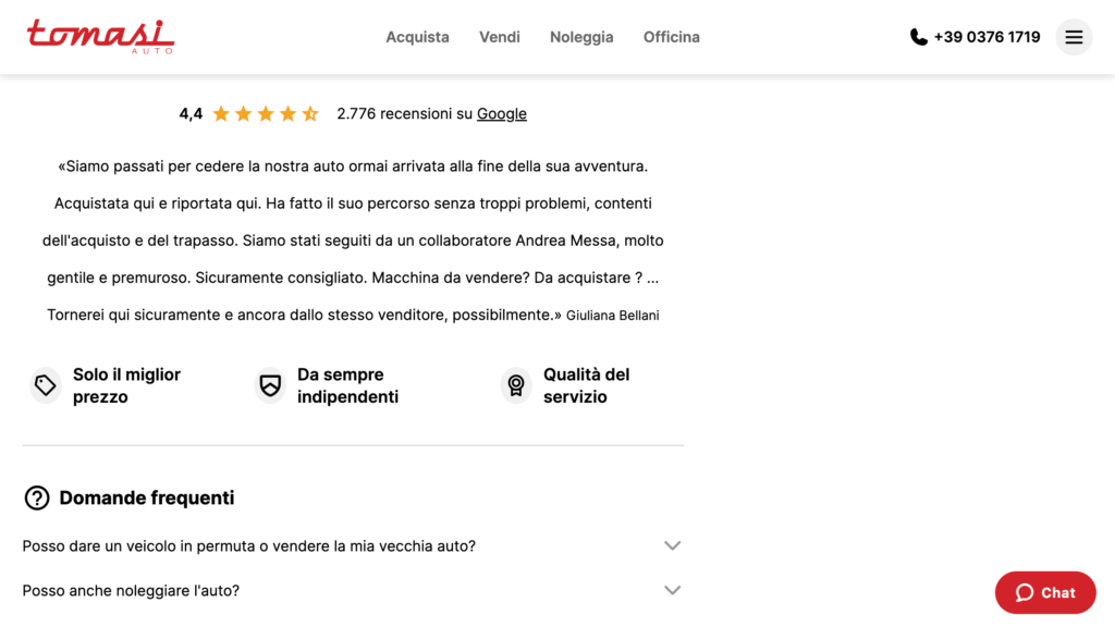
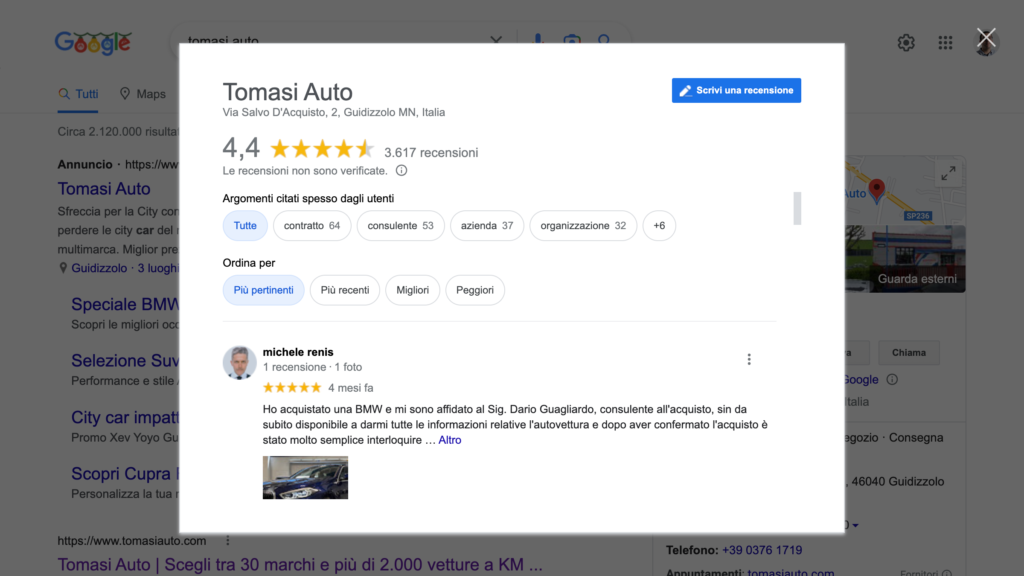
The Tomasi Auto car dealer site uses an auto-complete search that updates in real time based on what the user types in, immediately highlighting the matching brands and models.
“In the design phase, we mapped the needs of a person interested in a new vehicle and consequently defined appropriate paths to use cases.
For example, the site visitor could explore the entire offering by brand, by vehicle category, or by price range. On the other hand, the visitor with a specific vehicle in mind will be able to directly perform a text search. As soon as they start typing, they will be presented with the vehicles most likely to be related to their search by interpreting any typing errors.
This is a characteristic example of a feature that requires good design and a good technological solution to support it: to ensure relevant results we used MongoDB Atlas Search software, while to ensure fast response times we leveraged Cloudflare and Vercel caching systems.”
Sergio Panagia
Technical Director, Moze
Inspire users
For users who do not already have an idea of what they intend to buy, however, it is important to highlight new or best-selling products and make categories visible.
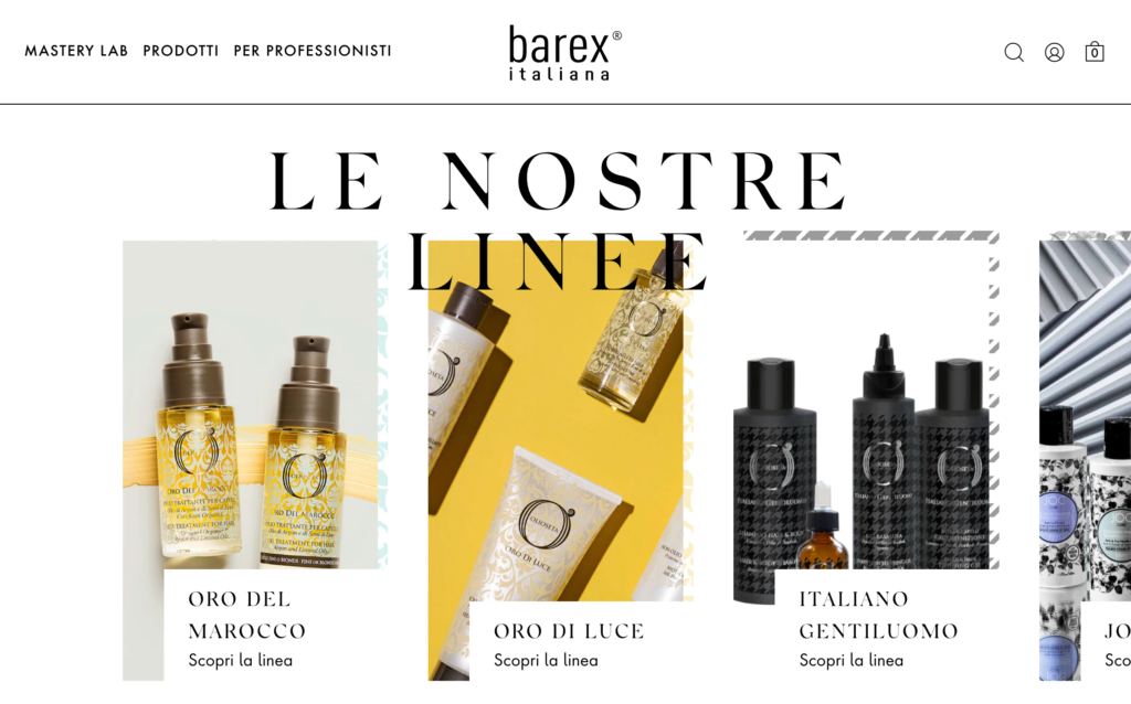
Barex Italiana uses the homepage and navigation menu to show the wide range of beauty products available, thus helping those who do not have a specific intention to find their way around.
“Some users looking for inspiration immediately head for the navigation menu, while others instinctively proceed to scroll the homepage.
In either case, it makes sense to immediately give users an overview of what they can find, using clear text and descriptive images to enable them to quickly locate the most interesting products, preventing them from leaving our site confused.”
Matteo Montolli
Design Director, Moze
Product Page
Describe the product accurately
Using high quality images and writing clear titles and detailed descriptions can help users quickly understand product features.
Overly technical language and jargon used within your company should be avoided. You need to describe products by making the user’s perspective your own.
By using images taken from various angles that are immediately visible, on ClioMakeUp’s e-commerce site the user can understand at a glance what the product looks like, what versions are available, and appreciate the details.
Show reviews
Reviews help users trust and have a strong impact on purchase choice. The goal is to make users feel that they are making an informed choice that aligns with other people’s positive experiences.
In addition to positively influencing the shopping experience, reviews play an important role in site ranking on search engines.
Checkout
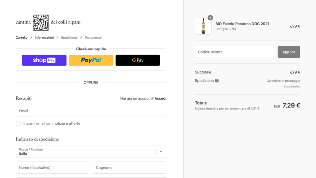
Clarify the necessary steps
Finalizing the purchase of a product online can take users, especially inexperienced users, a lot of time and energy. When they are ready to purchase, they need reassurance that the end of the process is in sight.
A progress bar is an easy way to show users where they are in the checkout process and allow them to move between steps, saving the information they enter to avoid forcing them to start over if there are interruptions.
To build e-commerce sites, we often use technology solutions such as Shopify and WooCommerce, platforms that facilitate the implementation of these best practices. For example, the Cantina dei Colli Ripani website benefits greatly from using Shopify checkout.
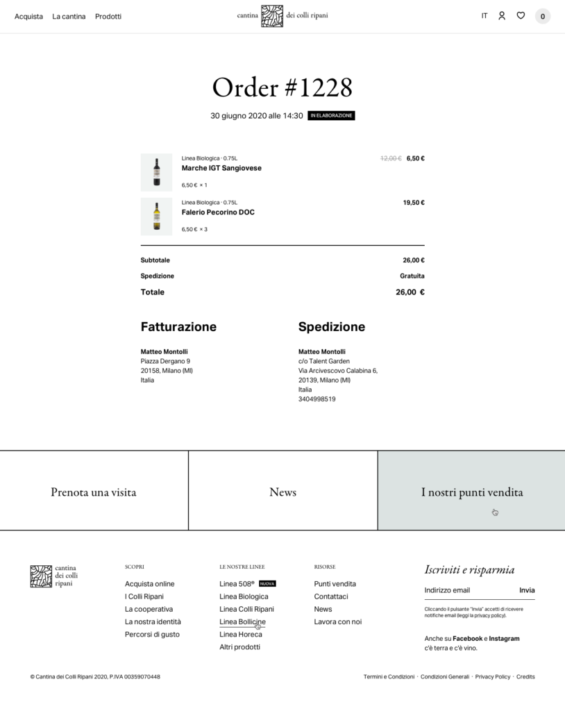
Show order details after purchase
It is a good idea to show the user a detailed confirmation page, including the list of products purchased, payment completion feedback, and billing and delivery information.
This gives the user confirmation that they have followed all the steps correctly, successfully completing the order.
Satisfaction
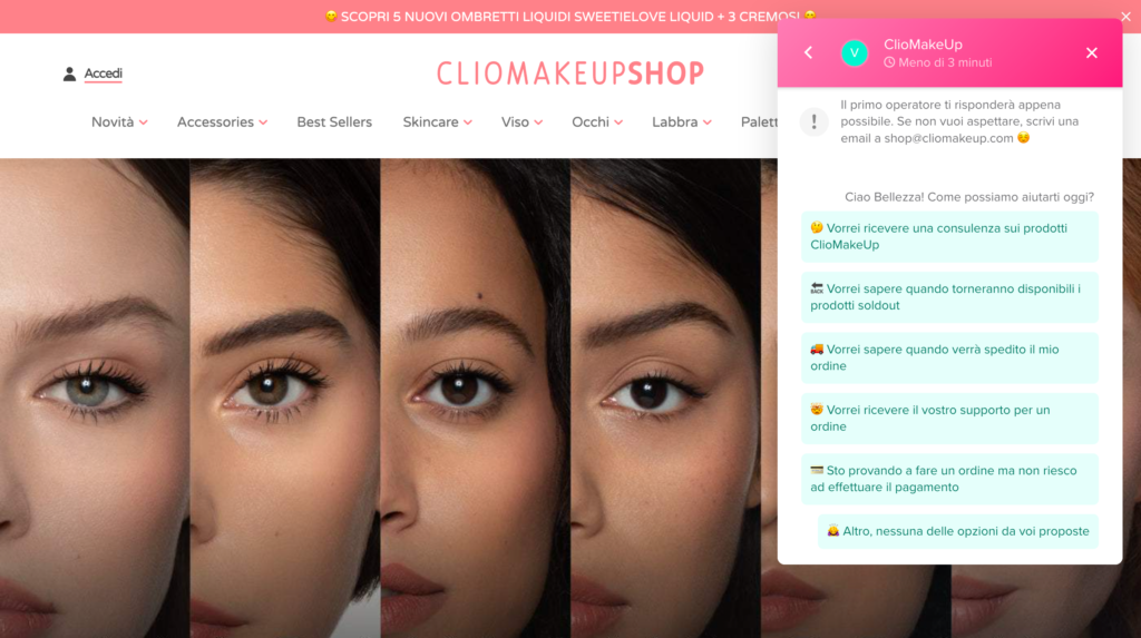
Offer support to your users
Responding to users’ questions throughout the purchase journey adds value to their experience within the site, reinforces trust and improves brand perception, encouraging word-of-mouth marketing.
In addition, offering support through direct channels such as chat, email, and social media is useful to learn more about user problems and identify new needs to be met, devising more products and solutions.
Maintaining a constant direct line with users is one of the main elements behind the success of the ClioMakeUp brand and its beauty products e-commerce.
Collect feedback
Gathering user feedback is very useful both to show reviews to other users, thus facilitating new purchases, and to keep track of the overall satisfaction level and progressively optimize the UX of our e-commerce.
There are several methodologies for gathering feedback from users, each geared toward investigating different aspects of their experience, including:
- Questionnaires, to investigate specific topics such as satisfaction after purchasing a product or collecting reviews.
- Qualitative interviews, to learn in depth about the users’ experience and bring out elements useful for devising new strategies or solutions.
- Usability testing, to capture users’ reactions in front of the prototype of a new version of the site, or in front of the design of a new page or feature of the same site, or even in front of the concept of a new digital platform, such as a mobile application intended to enrich the brand’s offerings.
Conducting these User Research activities on a regular basis allows us to gain sensitivity to user issues and keep abreast of their needs, thus helping us to evolve our e-commerce in the immediate term and remain competitive in the long run.
Did you like this article? Subscribe to our newsletter.