- UX & UI Design

The goal was not only to rethink the feel of the interface to reflect the company's new rebranding, but also to greatly simplify interaction, making it faster and safer to use without losing the control required in a clinical setting.
Rethinking the UX
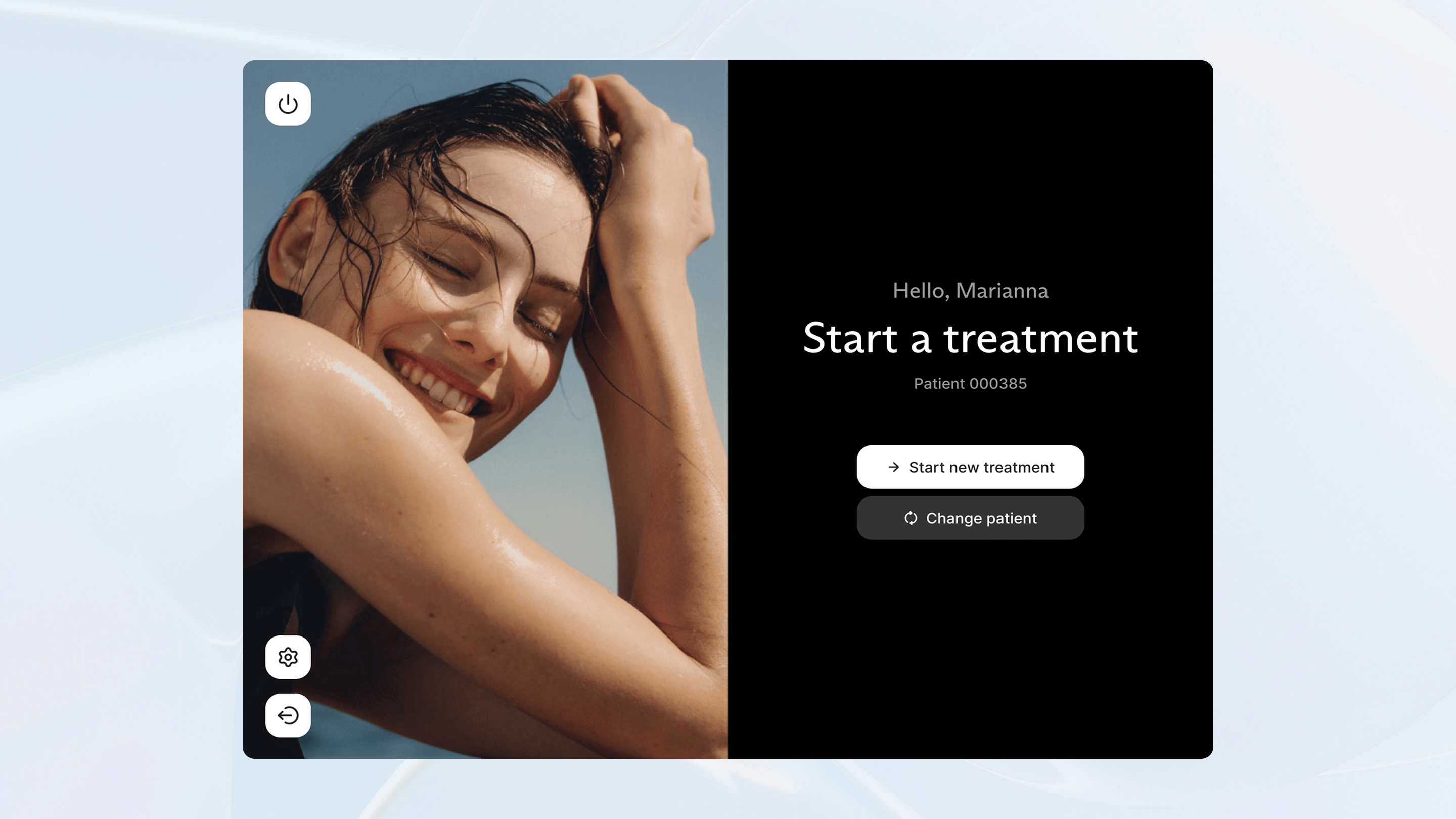
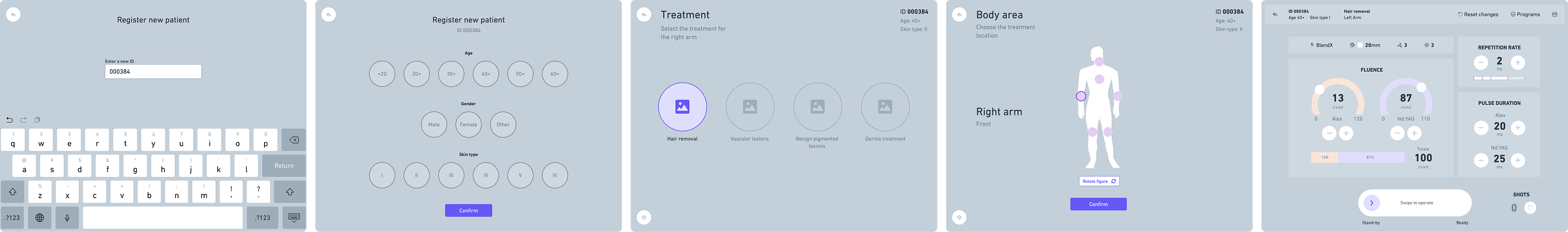
We started with a deep understanding of the user flow: patient preparation, parameter setting, preliminary testing, delivery, safety pauses, closure and recording. This mapping revealed the need to shorten the steps and eliminate redundancies and possible calibration errors. We redesigned the flows with a more linear sequence, in which the user moves seamlessly from configuration to calibration, from treatment to summary, while keeping an eye on critical parameters at all times.


With the user in mind
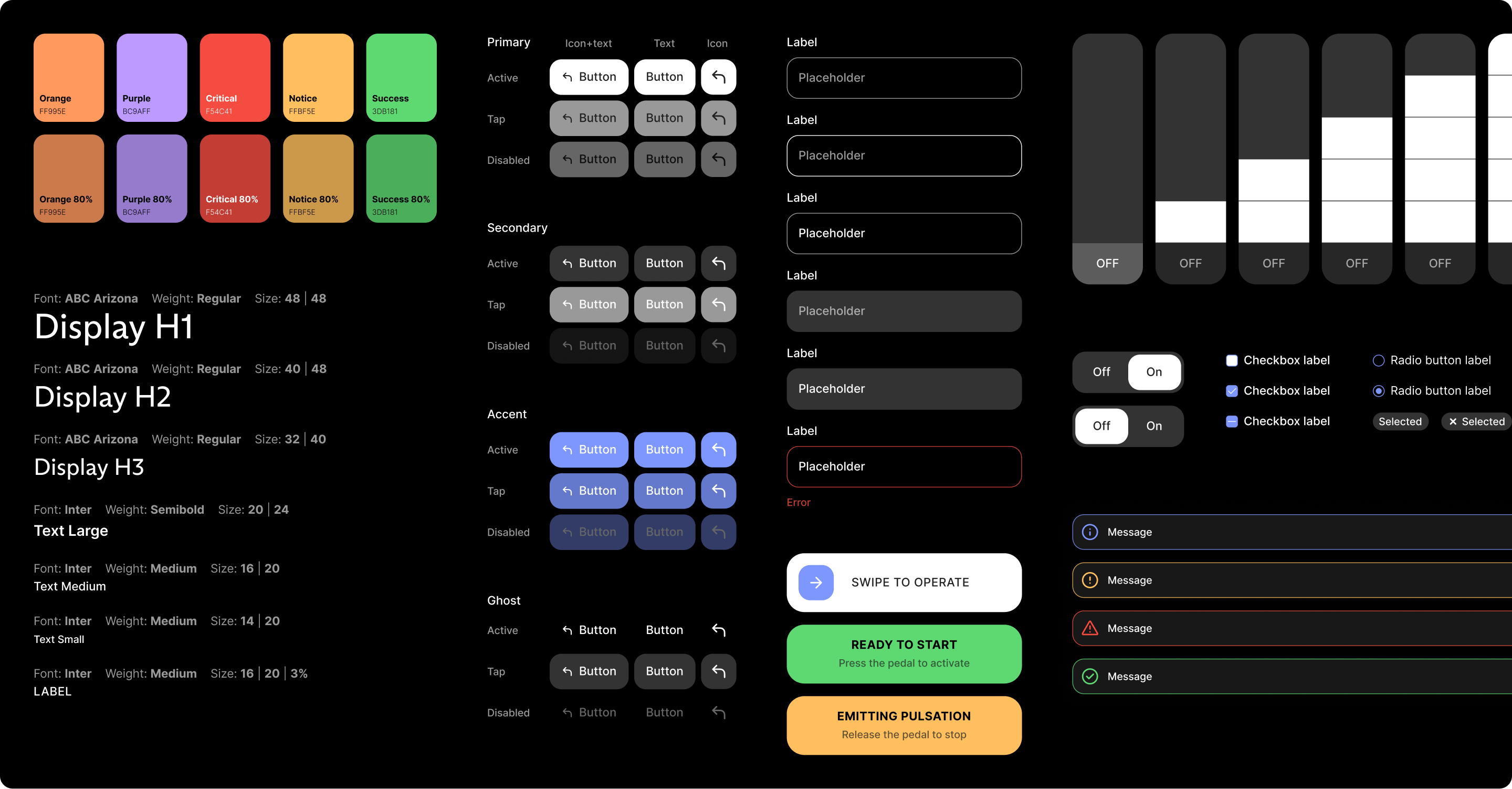
Dark mode was designed ‘by design’, not as an accessory theme. Since the glasses used by users alter colours and darken shades, we worked on the brightness ratio and the use of accents that visually contrast with green, especially for alerts and safety messages. However, colour is never the only channel: alerts and confirmations are reinforced by icons, clear micro-texts and consistent positioning, so that the information remains recognisable.

The interaction had to be calibrated taking into account the context of use, not only from a chromatic point of view. We designed large buttons, easy-to-grip controls and clear, immediate error and feedback messages. The terminology follows clinical usage, avoiding ambiguity.


A minimal and effective design system
To support the product's evolution, we have built an essential and consistent design system. The components have been made interactive from the design stage onwards, with tracked variations and documented behaviours. The result is an interface that supports professionals without slowing them down: clearer, more tolerant of altered vision conditions and more reliable when it comes to making quick and confident decisions.