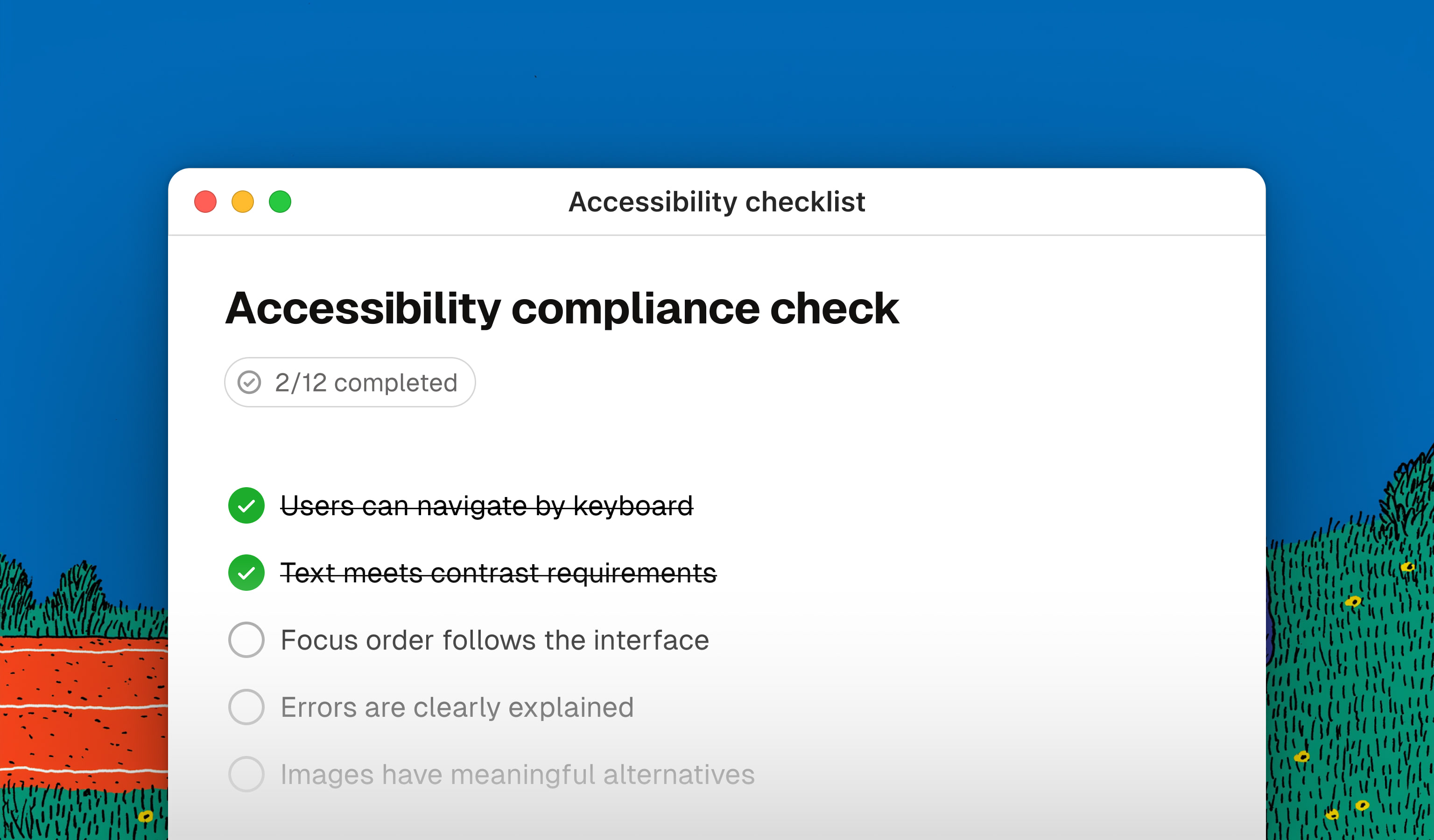
For years, accessibility was treated as that important thing someone would check at the end. Usually the developer. Possibly on the Friday before release, with a plugin and a certain faith in providence.
The European Accessibility Act does not invent accessibility, but it changes the tone of the conversation. In Italy, it was transposed through Legislative Decree 82/2022, and its provisions have applied since 28 June 2025, subject to the transitional arrangements set out in the decree.
For designers, the issue is very concrete: contrast, hierarchy, focus, forms, errors, and navigation methods take shape in Figma before they reach the code. If they start out wrong, they are unlikely to become accessible by magic during development.
This guide tries to do what we already did with the AI Act: take the law out of the PDF and bring it into the interface. With as little legalese as possible and a checklist that can be verified one item at a time.
1. First question: does this law apply to my product?
Not necessarily. The EAA does not apply to every website, app, or piece of software simply because it lives on a screen. It covers specific categories of products and services offered to consumers: e-commerce, banking services, e-books, electronic communications, access to audiovisual media, and certain digital services related to passenger transport. On the product side, it includes computers, smartphones, payment terminals, ticketing machines, and e-readers, among others.
An “e-commerce service” is a service aimed at concluding a distance contract with a consumer: not every commercial website therefore falls automatically within the scope.
It is still an important change in scope. Italy’s Stanca Law continues to regulate the Public Administration and certain large private organizations; the EAA brings accessibility requirements into many B2C experiences that could previously treat accessibility as no more than a virtuous choice. Virtuous, and therefore postponable.
Exceptions are not a “skip” button
A microenterprise employs fewer than 10 people and has annual turnover or an annual balance-sheet total not exceeding EUR 2 million. The exemption applies to microenterprises providing services, not to operators that manufacture or distribute products covered by the decree.
Derogations are also available when compliance would substantially alter a service or impose a disproportionate burden. But these cases must be assessed and documented: “it cost too much” in an email is not a proportionality analysis.
In Italy, Legislative Decree 82/2022 establishes different penalty regimes depending on the organization and the violation. For economic operators, administrative penalties can generally range from EUR 5,000 to EUR 40,000. For large private organizations already covered by the Stanca Law, failure to comply with an AgID formal notice may result in a penalty of up to 5% of turnover.
EAA, EN 301 549, and WCAG: law, technical reference, and design target
- Law: the EAA and the Italian decree define obligations and functional requirements.
- Current technical reference: the 2026 AgID guidelines use EN 301 549 v3.2.1 and WCAG 2.1 in their control sheets.
- Design target: WCAG 2.2 is a more up-to-date and useful reference for designers and developers, but the criteria added in version 2.2 do not automatically coincide with the technical-regulatory minimum currently applicable.
WCAG remains a fundamental operational tool, but it is not an automatic pass. Completing a technical checklist does not exhaust the legal obligation: the information provided to people, support services, documentation, and the ongoing maintenance of accessibility also matter.
2. From law to screen
Accessibility does not mean designing a parallel, slightly sadder version of the product for an abstract minority. It means designing one experience that can be seen, heard through a screen reader, enlarged, navigated with a keyboard, used through voice control, or touched with reduced precision.

There are four questions to bring into a design review:
- Does the information remain understandable without color, images, or audio?
- Can every function be reached and used without a mouse?
- Does the interface preserve its meaning and hierarchy when enlarged or read in sequence?
- Are errors, state changes, and instructions communicated clearly?
These aspects work together. An accessible form needs sufficient labels or instructions, a coherent focus order, text errors connected to their fields, and announcements that assistive technologies can interpret. Keeping a visible, persistent label is good practice; a placeholder alone does not replace it. Fixing the contrast of a red border and declaring victory is not quite enough.
Color and contrast
Accessibility objective: text, components, and information must remain perceivable by people with low vision or difficulty perceiving colors.
Impact on design: normal text must reach a contrast ratio of at least 4.5:1; large text at least 3:1. Borders, icons, and states that are necessary to understand or use a component also need a ratio of at least 3:1 against adjacent colors. Color cannot be the only signal: a red border needs to be paired with a message, an icon, or another explicit indication.
Typography, zoom, and reflow
Accessibility objective: content must be capable of being enlarged and must adapt to the available space without losing information or functionality.
Impact on design: avoid rigid layouts, fixed heights, and text embedded in images. Text must be capable of being enlarged to 200%; vertically scrolling content must work at a width equivalent to 320 CSS pixels without requiring horizontal scrolling, except for content where a two-dimensional layout is essential. A complex table may be. A hero with a clipped title is not.
Keyboard navigation and focus
Accessibility objective: every function must also be usable without a pointing device, and users must know where they are.
Impact on design: the focus order must follow the logic of the content, not just its visual arrangement. Every interactive component needs a clearly visible focus indicator, and the focused component must not be completely hidden by a sticky header, cookie banner, or overlay. Ideally, no part of it is covered. Removing outline: none without designing an alternative does not make the interface more elegant. It simply makes it unusable for someone.
Forms, errors, and feedback
Accessibility objective: fields, instructions, and errors must be identifiable and understandable; when possible, users must be able to correct what went wrong.
Impact on design: when user input is required, the field needs a label or sufficient instructions. A visible, persistent label remains good practice and is not replaced by a placeholder alone. An error message must explain what happened and how to resolve it, sit close to the field, and not rely only on color. Complex flows often need an error summary at the beginning and focus management that takes people to the problem instead of making them hunt for it.
Touch targets and interaction alternatives
Accessibility objective: controls must be activatable by people with reduced mobility or precision.
Impact on design: WCAG 2.2 introduces a Level AA criterion calling for targets of at least 24×24 CSS pixels, or sufficient spacing between smaller targets, with some exceptions. For primary controls, 44×44 pixels remains a good practice. It is a less appealing distinction than a post about “the ten absolute rules of accessibility,” but at least it is accurate.
Non-text content and motion
Accessibility objective: non-text information needs an equivalent alternative, and moving content must not obstruct reading or cause discomfort.
Impact on design: the role of images needs to be decided during design, rather than left to generic alt text written afterwards. Informative images need a useful description; decorative images should be ignored by assistive technologies. Animations, carousels, and videos must be pausable when necessary and must respect reduced-motion preferences.

3. Essential design review checklist
This essential checklist is intended for design reviews, handoff, and QA. Every item links to the specific technical criterion so we can distinguish requirements from good practices without turning every design opinion into law.
It does not replace a complete assessment against WCAG and EN 301 549, or the documentary and organizational obligations established by Legislative Decree 82/2022.
🔴 WCAG 2.2 Level A or AA criterion
🟠 Criterion to verify based on the content or context
🟡 Good practice, useful but not prescribed in these terms
Color and visual content
Standard text reaches a minimum contrast ratio of 4.5:1.
Large text, functional icons, borders, and component states reach the required contrast.
Errors, states, and categories can be recognized without perceiving color.
Informative images have a useful text alternative; decorative images are ignored by screen readers.
Typography and layout
Text can be enlarged to 200% without losing content or functionality.
Vertically scrolling content works at 320 CSS pixels without requiring horizontal scrolling, except for content where a two-dimensional layout is essential.
Headings, sections, and lists have a coherent hierarchy even when read outside their visual context.
Line length, line height, and spacing make long-form text readable.
Navigation and interaction
Every action can be reached and used with a keyboard.
The focus order follows a logical and predictable sequence.
Focus is always visible, and the focused component is not completely hidden by sticky elements or overlays.
Ideally, no part of the focused component is covered.
Interactive targets meet minimum size or spacing requirements; primary controls are more generous.
Complex gestures, dragging, and motion have a simple alternative.
Forms, feedback, and errors
When user input is required, the field has a label or sufficient instructions.
The visible label remains persistent and is not replaced by a placeholder alone.
Errors clearly identify the problem and, where possible, explain how to correct it.
Status messages are also communicated to assistive technologies.
Operations with legal, financial, or significant data consequences provide at least one mechanism among reversibility, error checking, or review and confirmation before submission.
Motion, audio, and timing
Moving content can be paused where required by the applicable criteria.
Animations respect the
prefers-reduced-motionpreference.Video and audio have captions, alternatives, or audio descriptions where required.
Time limits can be extended or disabled unless they are essential.
4. Tools help. They do not absolve us
Automated tests find recurring errors, but they cannot decide whether a flow is understandable, whether the focus order makes sense, or whether alt text describes what actually matters. And overlays that promise to make a site accessible with one line of code are not an invisibility cloak for compliance.

Our workflow can combine:
- plugins such as Stark or Able for preliminary checks in Figma;
- the ARIA Authoring Practices Guide for the structure and behavior of interactive patterns;
- axe-core, Accessibility Insights, and Chrome DevTools for automated checks and accessibility-tree inspection;
- manual keyboard and screen-reader testing on implemented interfaces;
- testing with people with disabilities, especially in critical flows.
The last point spoils the party for shortcut enthusiasts: technical conformance is necessary, but it cannot guarantee that a product is usable. An audit can tell us that a button has an accessible name. Only a person can tell us whether that name makes sense in context.
5. Accessibility is not a phase
The real cost arrives when accessibility is checked on the finished product. At that point, the Design System must be reopened, already-developed components must be changed, flows must be rewritten, and everyone gets to argue with deadlines that have, naturally, not moved by a millimeter.
It is better to distribute accessibility throughout the work:
- in research, by including people with different abilities and ways of using a product;
- in wireframes, by defining structure, reading order, and keyboard navigation;
- in the Design System, by designing accessible states, contrast, targets, and behaviors;
- in handoff, by documenting semantics and interactions, not just dimensions and colors;
- in QA, by combining automated checks, manual testing, and user testing.
This may be the law’s most useful consequence: it forces accessibility out of the final checklist and into the design process, where it should have been from the beginning.
Conclusions
The European Accessibility Act does not turn designers into legal consultants. It does, however, remind us of an uncomfortable fact: many compliance decisions take shape in the interface, long before anyone opens the code.
Designing an accessible product means making it clearer, more predictable, and more resilient to real conditions of use. It is not a creative limitation, a special version, or the finishing touch we will add “if there is time.” It is design quality. It is just a little harder to postpone now.
This guide is based on an operational reading of the European Accessibility Act, Italian Legislative Decree 82/2022, and the 2026 AgID guidelines, which use EN 301 549 v3.2.1 and WCAG 2.1 as technical references for assessments. The checklist adopts WCAG 2.2 as a more up-to-date design target. It does not constitute legal advice: a formal conformity assessment must refer to official sources and, where appropriate, qualified professionals. Article updated in July 2026.