Cyberwave was born from the experience of Vittorio Banfi, a Y Combinator alumnus and serial entrepreneur we’ve known since the days of BotSociety and Tailor, and his partner Simone Di Somma. Their return to working together is off to a strong start: €7 million in funding to build an ambitious platform from day one.
The startup enables the control and management of Physical AI systems, even in complex environments and across robots from different vendors. The company was still at an early stage and the product was evolving rapidly, but the brand did not yet reflect the scope, ambition, and technical depth of the platform.
From the outset, there was a need to build a solid and credible identity—one capable of clearly expressing the product’s vision and supporting a distinctive positioning, ready to sustain growth at scale.
- Brand
Building a system, not an aesthetic
We worked with a Lean Branding approach: reducing to the essentials, defining clear rules, and building a system even before creating an image. The goal was to design a functional identity, designed for everyday use across products, websites, and business materials, without losing consistency or expressive power.
A technical, essential and recognizable identity
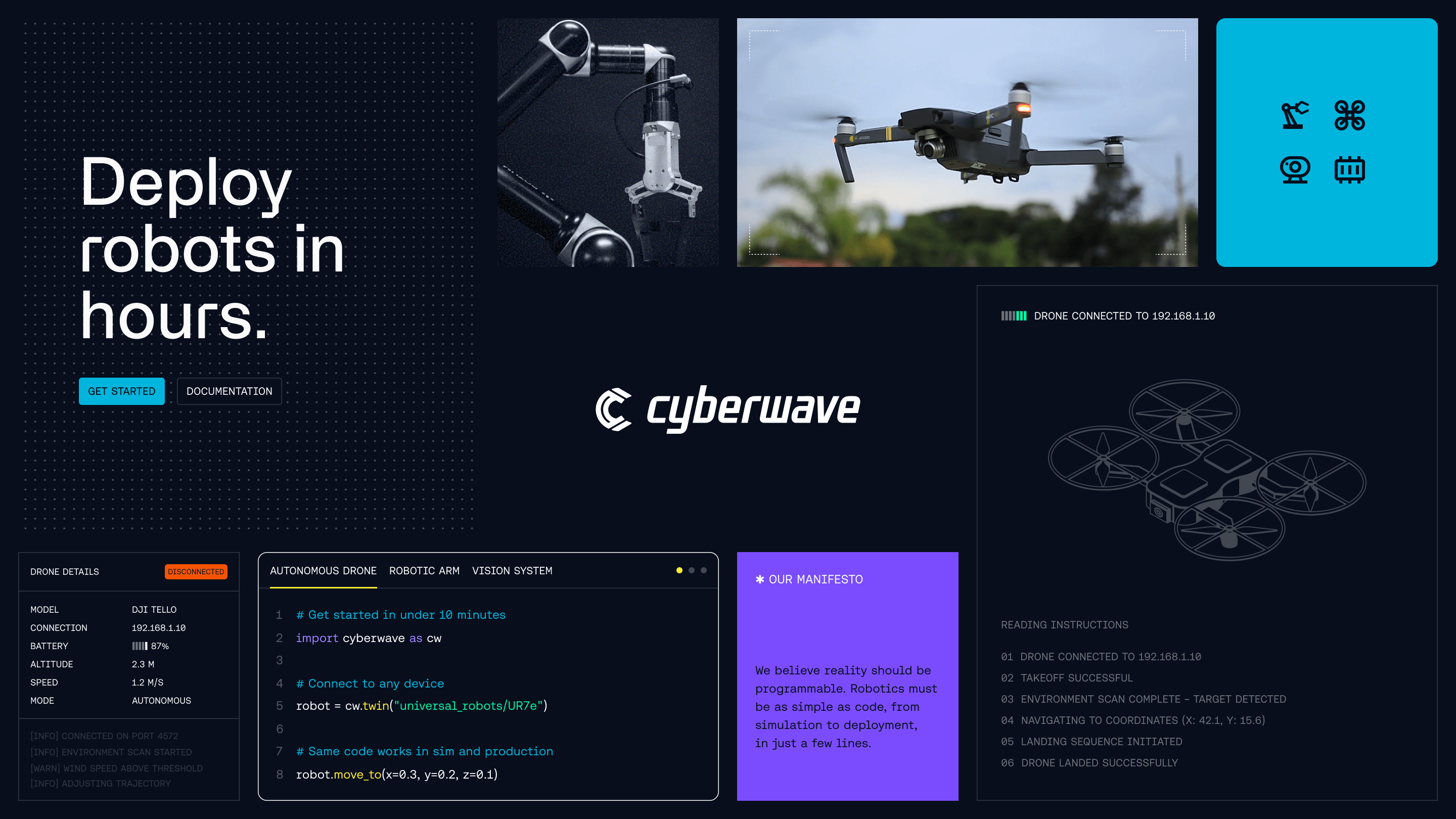
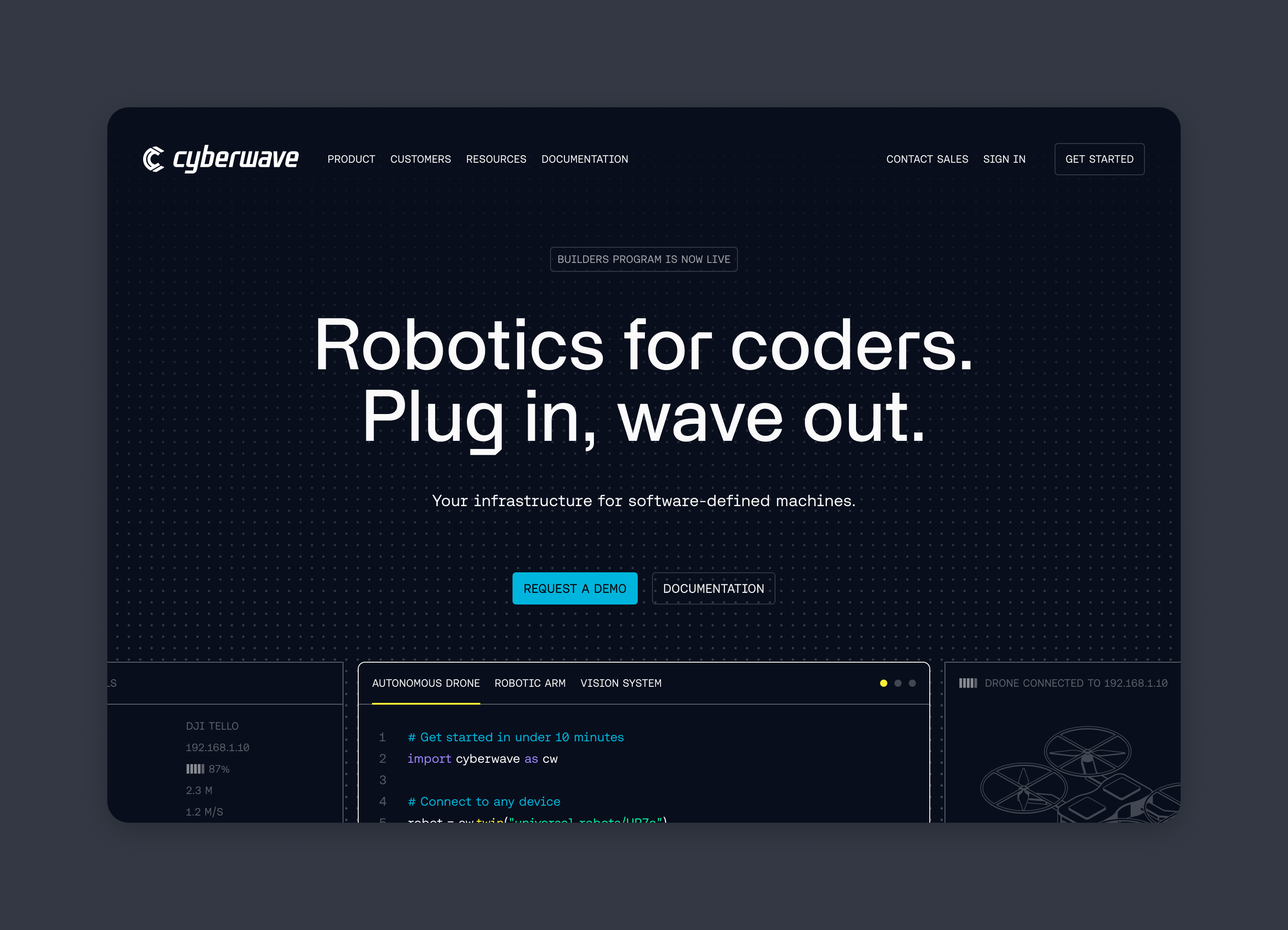
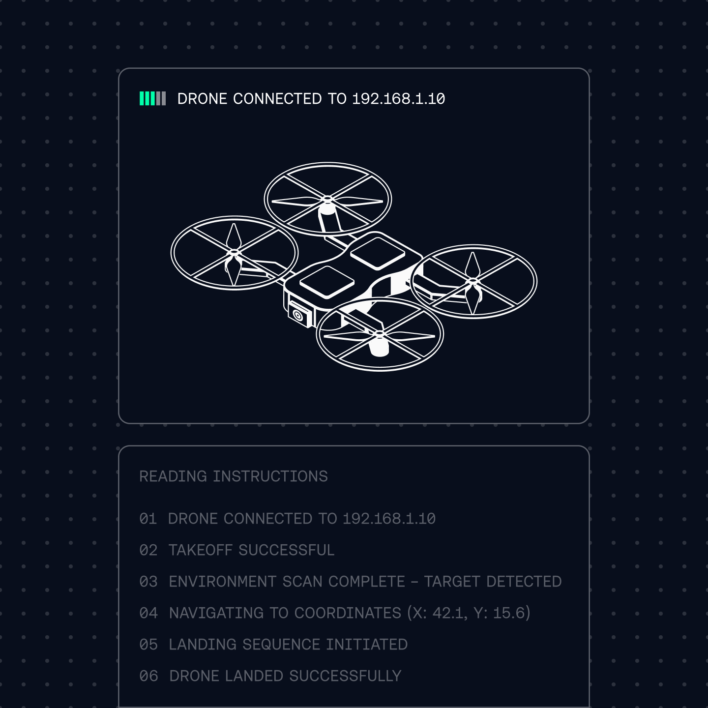
The visual system stems from a compact, three-dimensional sign, designed to function both as a symbol and as an interface element. A recognizable identity, yet flexible enough to adapt to different contexts.
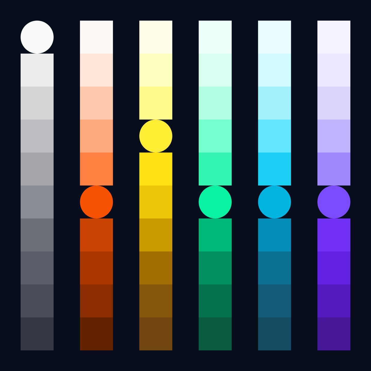
The palette combines a bright primary color with technical neutrals, chosen to ensure contrast, readability, and visual control. The typography reinforces the brand's tone: punchy headlines and a monospaced font aesthetic for text and UI components create clear hierarchies and a consistent language for a product designed for developers.
A language designed to live in the product
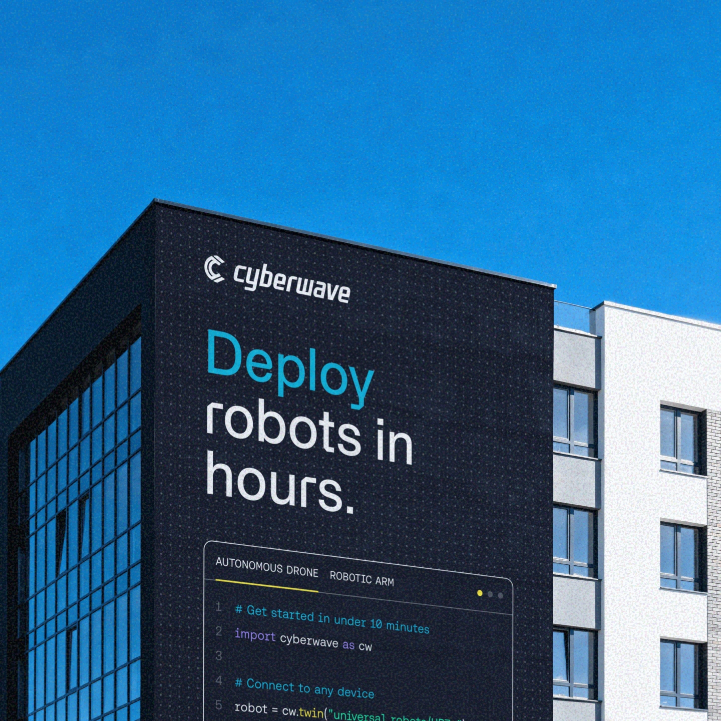
The identity was designed as a visual operating system. It lives on the website, where it accompanies the product narrative, in the interfaces, where typography and symbols become structure, and in the communication materials, thanks to patterns, grids, and essential technical illustrations.
The visual language moves between interface and technical abstraction, avoiding futuristic clichés and maintaining order even in highly information-dense contexts.
Vittorio Banfi Founder, Cyberwave
A brand ready to grow
The result is an identity capable of supporting the product's growth without losing clarity or recognizability. A rigorous yet flexible system, designed to speak directly to a technical audience and accompany Cyberwave over time.